It's an easy way to learn color and is more descriptive than 'orangey-red'. 'Orangey-red' could mean a number of things, but 'tomato-colored' is much more targeted.
When I am trying a new color or am attempting to pinpoint the shade that would look best on me, I mentally assign the color to a food item. Then, I section that food item off into groups.
This makes it easier for me to classify the color and, therefore decide if it is flattering.
Example: Beige
Biscuity (neutral)
-garbanzo bean (warm)
-snickerdoodle (neutral)
-mashed potatoes (cool)
See? I realize I sound a bit nuts, but it works for me. So, that brings me to my photo topic of the day: Princess Charlene of Monaco.
 |
| Charlene Wittstock, Princess of Monaco |
 |
| Looks like she stole Kate's nude pumps. |
This outfit is the color of a sugar cookie. It's a bit on the cool side and that works with her ice-blonde highlights and fair complexion. She has also grasped one of the keys to making a monochromatic look work: texture. Her skirt is a different texture than her belted poncho, which is a different texture than her leather gloves.
In short, this is fabulous.
But, don't get too excited.
 |
| Princess Charlene and Prince Albert |
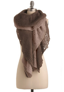
We now have the Taupe Monster. Taupe does not have an assigned food because it is half gray and half brown and that's a pretty easy concept to grasp.
Now, I actually really like the dress. It's bold to swathe her strong swimmers shoulders in an origami napkin of velvet, but she is quite tall and carries it off. And I don't even mind the color as much as I mind her face paired with said color.
 |
| At least she has color on her nails...? |
 |
| She could also use an eyebrow pencil. |
She has no color. I mean, she's put purple on her eyes (which is a mistake in my opinion), but has nothing on her lips and no blush. She looks like a weird, unfinished mannequin. Ladies, this is why we need blush. And lipstick. Something. Anything. Help her.
And what is with the Tin Tin hair? That mess is so full of Dep it could withstand a hurricane.
And does her uni-sleeve have a thumb hole? That's a cute addition on a sweater or tee, but on a formal gown? No.
Tilda Swinton would have done this better. But I suppose that's unfair because, when it comes to fashion, Tilda Swinton does everything better.
Charlene, you are both Doing It Right and Doing It Wrong. Kudos.


